Friday, November 20, 2009

sound illustration marker comps

These are my two marker comps for the slot machine illustration. I got some feedback on the first one (the bottom) which suggested to add lights to the slot machine. I did this for the second one and I think it helps you hear the "ding, ding, ding" of the slot machine. I'll probably use more of a red than orange in the illustration. This is my thanksgiving homework woo hoo!

Final World Record Poster

This is my final for the world record. I added the text to be like the caution signs saying "life with caution". I'm happy with most parts of the illustration and I like the colors. I would say the guy's face gave me a lot of trouble and whatever changes I made didn't show up as well in the picture I took of the illustration.

first rev. Joe 6-pack

My concept so far for this project is some sort of beer. Sarah gave me the idea that based off of my color scheme I could do some sort of fruity beer like raspberry. The name for my drink is going to be EMCEE. I got this from the beginning of my first name and my middle initial which is C. I'm kind of going with a trendy design. My logo isn't finished yet, but I used a photoshop brush and layer filters to create the green texture.

Final Society of Illustrators


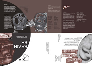
For the final revision I worked on making the first of the three textured panels bolder. I also worked with different cutouts that I think resolved the piece better. The text visibility of this piece was really hard to resolve. I had to do different prints experimenting with the colors and print settings. I ended up duplexing both sides on the same piece of paper so it would fold easier. I'm happy with the result.

Monday, November 16, 2009

Sound illustration

At the bottom are my initial comps for the sound illustration. I got the most feedback about the cork popping and the slot machine. When I did the tighter pencil comps I decided there was more to work with by doing the slot machine so I'm going to go with that. Marker comp to come.

MO postcard final

This is my final printout for the Missouri postcard. It was hard to match the colors from my original marker comp in the illustration so I tried to get as close as possible. I don't like scanning the final image and presenting it because I think you can see more detail on the actual illustration. When I scanned it a lot of the yellows and greens turned to one similar green shade. So I worked in photoshop to try to get some of the yellow to stand out.

more S of I

This is my third revision of the Society of Illustrators direct mailer. I added more texture to the inside and pulled more images from the actual illustration. I can't quite figure out what I need to fix, but I know it's not finished yet.

Wednesday, November 11, 2009

a CANADIAN thistle...

Yes, Rusty it's a Canadian thistle.. not a Scottish thistle. Although the two are really similar. So this is my marker comp for the Missouri postcard. I decided to draw a weed since Missouri has lots and lots of them. I'm happy with my comp and most people had positive feedback. I think it has a lot of fun colors.

red barn crap... 2

Well I'm probably starting over again so there's not really a point of writing about all the stuff I did. Boo red barn.


society of illustrators rev 2

I added some texture on the inside panel and pulled some of the jumbled type from the illustration to add some movement throughout the piece. For the next revision I'm going to get rid of all of the solid color and try to incorporate more texture. I'm not sure how I'm resolving the eye and I still need to work a lot with the text.
I'm going to work to make the type on the poster side stand out more.

Wednesday, November 4, 2009

my airbrushed pride and joy

I was a bit intimidate by the airbrush and upon hearing we had to do a fruit I was worried. But I'm actually really excited that my strawberry came out this well. I used one square piece of frisket and cut various shapes from the strawberry out of it. I went in afterwards and drew the yellow seeds with colored pencil. I worked from dark to light for the most part and airbrushed the background first.

I'm not sure what my next fruit will be...

cheesy illustration

So I googled Lisa Frank to find a cheesy, colorful image to work with. I found one of penguins hugging so I made a marker comp of that. I like this one because of all the crazy colors. I think airbrushing this will definitely be hard, but it will be interesting to try. Who knows, it might be good...

so glad about the extension.

another comp for world record

From this comp I'll move forward onto the final art. For the final piece I'm going to make the boxes more dominant in the background. I want to try to do this on watercolor paper and see what kind of colors I can get. I will probably use some black line art as well. I'm soooo excited this is due on Monday!

final conversation print out

I'm happy with the way it came out. I think the black lines and the visible paint strokes go with the 'back-alley' scene and the cartoon-like feel. The colors turned out pretty close to the way I painted them. I'm glad I chose to use watercolor on this assignment. I think it gave me more room to mix colors.

red barn crap...


I only had 3 out of 4 things to present today for the red barn event. Here are my REALLY rough ideas.


Monday, November 2, 2009

society of illustrators direct mailer

This direct mailer folds in half and then into three panels. The illustration I'm using is by Brian Raszka. His illustration deals with a montage of imagery so for the information side of the piece I took parts from the original illustration and incorporated them into the text.