
Advertisement coordinating with chosen professional photo
11 x 17, two page spread, full color
When I picked this picture I knew my layouts would need to deal with the outdoors. I decided to advertise for a campground in Missouri. Since the most important part of an advertisement is the call to action, I decided to put emphasis on the words "outdoors" and "camp". On the right side I found a coordinating picture to sit in with the necessary text. The opening paragraphs give reasons to go camping and discuss Missouri's campgrounds. The two columns underneath contain specific information pertaining to Ozark Trail Campgrounds. I went with the colors green and brown/yellow to go with my original image. I think there is a good use of white space in this layout and it sends the appropriate message. Since being in the outdoors is associated with serenity and rest, I wanted an uncluttered layout.

Rapala Lures Advertisement
11 x 17, two page spread, full color
This Rapala spread went through a lot of changes since the version I turned in last week. I moved around the picture on the wall and the intro paragraph. The headline stayed pretty similar, but I'd say it's more uniform and I think it works better. On the left side I go rid of all of the lures and used one as an accent. The lure connects the text with the sidebar advertising the Rapala fishing club. The blue/gray color is a nice accent to the image and goes well with the red Rapala logo. I think this layout has enough balance with text and white space. I used size and color to emphasize the sub headers. This layout was pretty difficult to resolve and overall I'd say I spent around 8-10 hours on it. With two final versions I think that estimate is about right.
 "How Safe?" Layout
10 x 14, two page spread, full color
I had a lot of fun doing this spread dealing with the vibrant colors. Since this spread had limited text, I focused on finding a good image. To provide some contrast I reflected the image with a lighter opacity and placed the photo caption in the reflection. I also lined up the headline with the body copy which shows a grid structure. To make the text pop more I made the 'o' in 'How' the orange/red color along with the drop cap. The intro paragraph is green to tie in the green peppers. This one was easier for me to deal with because I really enjoyed the imagery so I'd say I spent around 4 hours on it.
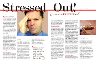 "Stressed Out!" Layout
11 x 17, two page spread, full color
The first thing I did on this layout was to find imagery that related to the topic. I used stock photos that were high resolution. On the left side image I cob'd the guy and put in a more neutral color. The watch picture goes along with the first image and breaks up the text on the left side. The pull quote also helps break up all of the text. I focused a lot on making sure the text lined up and there were no widows or orphans. I didn't want the layout to be too overwhelming with red so I used it as an accent color with the red rule at the top and with the sub headers in the type. Also, for the heading I wanted it to go all the way across to tie the two pages together. I'm pretty happy with this layout and spent about 4 hours on it.
 Ceramics Flyer Redesign
8.5 x 11, black and white
This is one of the flyers that I redesigned for my portfolio. On the first version I liked the hand print so I wanted to keep that. I decided to add another hand print to enhance the "get your hands dirty" message. The fonts were changed too to better relate with one another. I used a more messy font for 'ceramics' to add some contrast. It also helped for me to put a grid in for this re-do. I think this new layout is simpler and has a better flow between parts. The re-do took about two hours.
 Greek Language Class Flyer
8.5 x 11, black and white
I started completely over on this flyer in terms of concept and imagery. I actually found the image first and though of a concept to go with it. Since the grecian figure is reclining I wanted to go with the laid back feel of Greek culture and the sun-kissed glow that Greeks have so I came up with "bask in the grecian glow". I wanted to go pretty simple with the layout since the image is very dominant on the flyer. I think this flyer not only gets the message across, but would appeal to a college audience. I spent 1-2 hours on this redesign.


 "How Safe?" Layout
 "Stressed Out!" Layout
 Ceramics Flyer Redesign
 Greek Language Class Flyer
No comments:
Post a Comment